An introduction to signal detection theory for the lab meeting hold on the 22nd of July 2024.
Is Wally there?
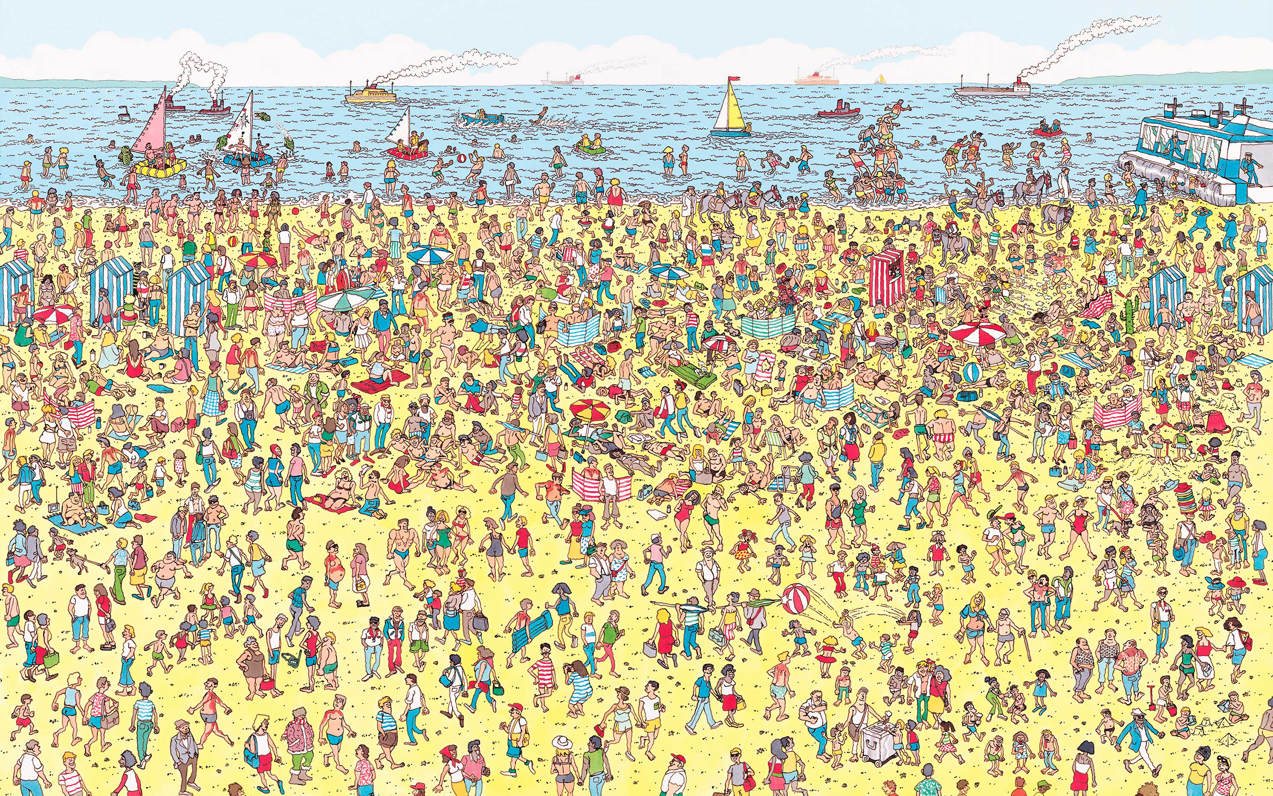
Here is a fun experiment. I’ll show you a picture from the puzzle Where is Wally? and you need to tell me, as quickly as possible, whether Wally is in there or not. That’s correct, I don’t want to know where Wally is - that’s the standard game - I want to know if he’s present in the picture. You can give me only two possible answers, “YES” or “NO”, and your time is limited.
Click on the link here and write down your answer for each image (or just answer in the moment, there are no solutions for this small example).
How was it? I bet some “trials” were simple, while others were hard, so much so you have randomly guessed - or at least this is what you think. Crucially, however, how hard each trial was might vary from person to person, especially for those images that were somewhat in the middle. Some of you might be serial Where is Wally players, others might have seen these pictures for the very first time now and have no clue what is happening here. This is interesting! It means that the same exact images can be perceived and processed differently by different people. Ok, this observation is not ground-braking but it allows me to introduce the question we want to tackle today:
How do we assess and quantify someone’s performance in a given task?
We will tackle this question with Signal Detection Theory (SDT)
Setting some boundaries
The question is large in scope. What do I mean by performance? Which tasks are we talking about? The time we have is limited (and my brain as well), and even if SDT can be employed in a variety of cases, we will focus only on the two most common and basic tasks: (1 Alternative Forced Choice Task (1AFC) (aka YES-NO tasks, but I think this name is misleading) and 2 Alternative Forced Choice Tasks (2AFC).
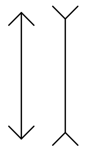
1AFC: As described in Hautus, Macmillan and Creelman, these tasks aim to distinguish between stimuli. Modifying the book a bit, an example is deciding whether an MRI brain scan shows abnormalities or not. If we want to stay more in the cognitive psychology realm, whether the Müller-Lyer line on the right is longer than the one on the left.
It’s not - trust me. As hinted above, these tasks are commonly known as YES-NO tasks, because they often allow only two answers, maybe and perhaps. However, this is not necessarily the case and many other tasks that are not Yes-No tasks require a yes-no answer. So, I prefer the name 1AFC (unfortunately, I don’t remember where I read about this definition, as it’s not mine). The 1 in the definition represents the number of stimuli you present at any given time. One MRI scan, one line (other than the comparison), and one image with or without Wally.
2AFC: If 1AFC are clear, 2AFC are simply their expansion. Here, you present two stimuli within the same task. If we modify our Wally experiment, we could ask Is Wally present in the image on the right or on the left?
Is the MRI of person A to have abnormalities or the MRI of person B? Is the line on the left or the line on the right the longest? Now you see where I think can be confusing. The line example can be either a yes-no task or a 2AFC task, depending on what you ask the person to do. Note that you can expand these tasks even further, with a 3AFC, 4AFC, 5AFC… with each number representing your score on a sadism scale.
Sensitivity
What are the interesting aspects of these tasks? Well, firstly, their goal is to test a person’s sensitivity to something. In other words, their ability to discriminate something. In our Wally experiment, whether Wally is present or not. Someone with high sensitivity to Wally would be able to tell quickly and accurately whether Wally is in a picture or in which of two pictures he is. People that suck at this game, instead, have low sensitivity and struggle to answer correctly even with simple images.
Obviously, saying that someone is good at something is not a very scientific way to quantify sensitivity. So, let’s think about how we can measure your sensitivity to Wally. The first and most obvious step is to count how many times you correctly found Wally (you need to see him to say that he is there). Because this value depends on the number of pictures you have been presented with, we divide it by the number of pictures that contained Wally. This way, we can compare this value across studies, and our measure is independent of the number of trials. This measure is called the hit rate.
Hit rate: proportion of trials where the person correctly identified the presence of a feature of interest
This measure is nice and easy to interpret. You scored a hit rate of 90%, well done! You are terrific at finding Wally. You scored a hit rate of 50%. Well, you were probably guessing. You scored a hit rate of 20%… mmm I’m not sure what you were doing there… the opposite of what you have been asked? Hooowwwwever… looking only at your hit rate is problematic. Think about this: what if you could not be bothered to do a task, but you had to complete it anyway? What’s the fastest way you can achieve your freedom? Perhaps you could provide the same answer over and over.
Imagine this: if you say “Wally is there” every single time, you will get a hit rate of 100%. Every time Wally was in a picture, you “found” it. Here is where the pictures without Wally (lure trials, catch trials… call them as you like, I like to call them igotchya trials) become important. Using your “always say yes” strategy, you end up saying that Wally was there every time he wasn’t.
So, what we ALSO want to look at is the number of trials without Wally where you said you saw him. Again, we divide this number by the total number of Wally-less trials, and we obtain your false alarm rate.
False alarms: proportion of trials where the person incorrectly stated the presence of a feature of interest where the feature was not there
If we want to be precise, we can split your answers into four categories:
Wally is there
Wally is not there
You say “yes”
HIT
FALSE ALARM
You say “no”
MISS
CORRECT REJECTION
We can now formalise our definition of hit and false alarm rate.
Note that, by the definition above, hit and miss rates are complementary. If your hit rate is 85%, your miss rate is 25%. The reason for this is that they are both computed on the number of trials that contained Wally. The same goes for the false alarm and the correct rejection rates.
Because hits and false alarms include information regarding all the possible types of answers, we can just use those to compute, where were we? … oh yes, a measure of sensitivity.
d-prime
If you have high sensitivity to finding Wally, you are either very good at (1) finding when Wally is present, (2) finding when Wally is not there, or (3) both. (1) is indexed by your hit rate, and (2) by your false alarm rate. This means that we should expect our sensitivity measure to increase if (1) the hit rate increases, (2) the false alarm rate decreases, or (3) both. A measure with these characteristics can be obtained by subtracting the false alarm rate from the hit rate (for 1AFC tasks, an adjustment of $\frac{\sqrt{2}}{2}$ needed for 2AFC tasks), but the concept is similar).
Think about this. If your hit rate is high and your false alarm rate is low, the result of the subtraction would be high. Vice versa, if your hit rate is low and your false alarm rate is high, the subtraction will be (in absolute value) high. If your hit rate is high and your false alarm rate is high too, the result will be low. Finally, if you have the same hit and false alarm rate, then the result will be 0.
In signal detection theory, this measure is called d-prime or d’ and it is computed on the standardised hit and false alarm rates - where standardised means that they have been converted into Z-scores:
\[d' = Z(\text{hit rate}) - Z(\text{false alarm rate})\] The interesting thing about d’ is that the same d’ value can be achieved with different proportions of hit and false alarm rates. One way to visualise this, is through the Receiver Operating Characteristic curves.
Code
d_prime <-seq(-3, 3, by=0.01)fa <-seq(0, 1, by=0.01)# Create data to plotroc_curves <-list()for (d in d_prime) {# Compute hit rate current_hit <-pnorm(d +qnorm(fa))# Create dataframe containing all relevant info current_roc_data <-data.frame(dprime =rep(d, length(fa)),hit = current_hit,fa = fa ) roc_curves <-append(roc_curves, list(current_roc_data))}roc_data <-Reduce(rbind, roc_curves)roc_plot <-ggplot(roc_data, aes(x=fa, y=hit, frame=dprime)) +geom_line(color="purple", linewidth=1.5) +geom_segment(aes(x=0, y=0, xend=1, yend=1)) +labs(x ="FA RATE",y ="HIT RATE",title ="d'" ) +theme_minimal() +coord_fixed(xlim =c(0,1), ylim =c(0,1), expand =TRUE)ggplotly(roc_plot)
The purple curve above represents all the combinations of hit and false alarm rates that result in the same d’. The diagonal black line represents a d’ of 0. As said above, you achieve this value every time the hit and false alarm rates are the same. Usually, only ROC curves above the positive diagonal are reported. These represent d’ values above 0. It is extremely unlikely that you will deal with d’ below zero (ROCs below the positive diagonal), as they reflect scenarios where someone had fewer hits than false alarms. To achieve that, a person needs to do the opposite of what is asked. However, it can happen that on a small number of trials, the participant’s performance falls to chance level and, just by chance, you get a d’ just below 0. You might see this, for instance, in difficult tasks if you analyse blocks independently.
So, to recap, d’ measures a person’s sensitivity in a task by accounting for correct and incorrect responses in trials containing the target characteristic and lapse/ catch trials.
Bias
Another aspect of performance we might be interested in investigating is whether someone has a tendency to provide one specific answer instead of another. For instance, in conditions of uncertainty (like the majority of psychological tasks), you might be more prone to report something - maybe you believe that this will make the experimenter happy (it doesn’t). Or maybe you are left-handed, and you tend to report more with your left hand - randomisation is key in experiments, isn’t it? This is problematic if we want to assess the sensitivity of a person. Because the same d’ can be achieved with multiple combinations of hits and false alarms, it is possible that two people can score the same sensitivity, even when one is really trying their best in the task and the other has a strong bias for providing one specific response. Obviously, the two situations are not the same and we should be aware of that. Let’s see another example.
Two people complete our Is Wally there? task. Here are their hit rate, false alarm rate and d’ scores:
Person A
Person B
HIT
0.73
0.91
FALSE ALARM
0.08
0.25
d’
2.02
2.02
Wow, two different performances but the same sensitivity values!
Alright, you probably got the point now. So, what can we do about this? The answer is simple: we want to find a measure that represents whether a person’s sensitivity is unbiased or not. If not, towards which answer the bias is. Thankfully, SDT provides a simple answer to this question: the criterion or c. c is derived again from hits and false alarms and, for our simple case of 1AFC tasks, it is computed as:
\[c = - \frac{Z(\text{hit rate}) + Z(\text{false alarm rate})}{2}\]c assumes a value of 0 where the responder is unbiased. Positive values indicate a bias towards not reporting something. Negative values indicate a bias towards reporting something. The reason for this is the relationship between false alarms and misses and between hit rate and correct rejection. We won’t get into these details now, but we can build some intuition and connect the discussion back to sensitivity by looking at an updated version of our ROC plot.
Set the d’ to 2.02, from our example above. Now, if we look at participant A, we see that it falls within the orange area. This indicates a tendency for this participant to report that Wally is not in a picture. Participant B, instead, falls within the green area, which indicates a tendency to report that Wally is there. Indeed, their hit rate is high, but their false alarm rate is too! In other words, while the first participant has a NO bias, the second one has a YES bias.
NOISE and MODELS
After this brief intro to the two main SDT measures, we need to talk about how people make decisions. In doing so, we will build more insight into d’ and c. To keep the discussion simple, we will solely focus on 1AFC tasks, as they are one-dimensional and easy to understand. Just know that 2AFC tasks are simply a 2-dimensional version of 1AFC tasks.
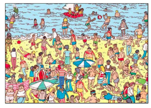
In 1AFC tasks, the person is asked to judge one stimulus at a time and to provide one of two possible answers - commonly YES or NO, though not always. Because our Wally task is a YES-NO task, I’ll go with this, though you can swap these answers for anything you want: LEFT and RIGHT, NEW and OLD, REMEMBERED and FORGOTTEN, etc… Look at the picture below
Wally is just on the right of the white and green umbrella. How did we find it? Well, we needed to sieve through the wall of information presented to our eyes. Specifically, irrelevant information. Or, as we like to call it, noise. To say that Wally is here means that we processed the noise within the image as long as Wally, the signal, and decided that the evidence favouring the presence of the signal is higher enough for us to say YES, Wally is here! Another way to say this is that we have collected enough evidence for us to state that we saw something relevant.
Two things are at play here:
Noise vs Signal
Enough evidence
These are intertwined, as are most things in life. This is a good enough reason for me to start discussing the second point, completely disregarding the order of the list I wrote. So… enough evidence. How much is enough? Well, it depends. All of us have a different threshold. Some of you might have originally said that Wally was not in that picture. The strength of the signal (Wally standing there creepily wearing a beanie on a beach) was not strong enough to overpower the noise of all those red togs. Others, instead, might have said yes, their eyes are well attuned to spot people who are going to get a heat stroke. Or, some of you might be biased towards saying they did not see anything (don’t worry, I’m not the police, you can tell me where Wally is). Others might have a bias for YES.
Sweet, the threshold for enough evidence is determined by (a) the stimulus itself and (b) the personal bias. The stimulus is a mix of noise and signal so that the closer the noise is to the signal (e.g. all the red and stripes in the picture) and the weaker the signal itself (imagine a teeny-tiny Wally), the more difficult it is to separate the two. We are now at the first point on the list. Obviously, noise and signal are two very broad terms, but this is good for us because we can do what every good scientist does when dealing with something vague: create a normal distribution. The simplest - but powerful - SDT model to explain performance in a 1AFC task is a Gaussian Model, where the probability of classifying something as noise (NO) and the probability of classifying something a signal (YES) are described by two Gaussian.
Play around with this app. The two curves represent noise and signal. These curves, specifically, tell you the probability of something being noise (or signal) given a specific value of one dimension of your stimulus (x-axis: here can be anything, image contrast, familiarity, etc…). The simplest model implies that the two curves have equal variance, though this assumption can be relaxed. Try to modify the noise spread or the signal spread.
By modifying the d’ value, you see that the curves get closer or farther away. Why the distance between the centres of these two distributions reflects sensitivity? Well, higher sensitivity means that you can correctly discriminate a signal (Wally) even when it looks like noise (everything else in the scene). That is, you are able to obtain a high hit rate and a low false alarm rate even when the two distributions overlap.
When do you report a signal? When you have gathered enough evidence in support of the signal. Enough here is determined by c, which is the vertical line. There are a couple of things to note about c. Firstly, note that its placement determines the proportion of hit rate and false alarms. The hit rate is represented by the area under the noise+signal curve above and beyond the c line (how many times something that is a signal is defined as a signal). Similarly, The false alarm rate is defined by the area under the noise curve above and beyond the c line (how many times noise has been classified as signal). Toggle the Noise and Noise+ Signal distributions. Moreover, note that the value of c defines where you end up on a d’ ROC line. That is all the different combinations that give rise to the same d’ reflect different levels of bias.


 Wally is just on the right of the white and green umbrella. How did we find it? Well, we needed to sieve through the wall of information presented to our eyes. Specifically, irrelevant information. Or, as we like to call it, noise. To say that Wally is here means that we processed the noise within the image as long as Wally, the signal, and decided that the evidence favouring the presence of the signal is higher enough for us to say YES, Wally is here! Another way to say this is that we have collected enough evidence for us to state that we saw something relevant.